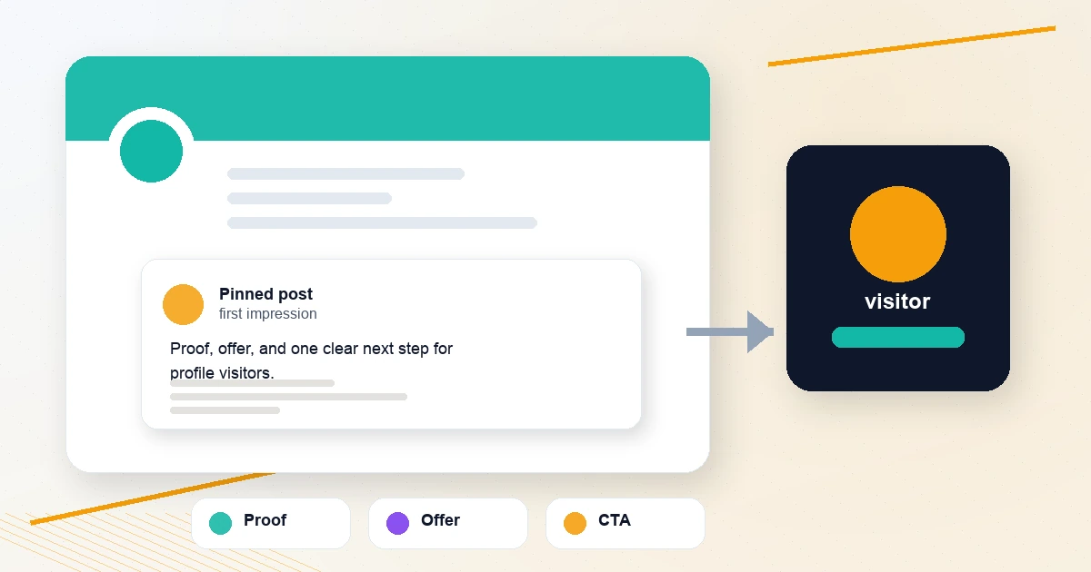
The compose box is too generous.
It gives your draft full attention. It lets you read slowly. It hides the fact that the post will land in a feed where it has roughly one second to win the eye against six other posts, an ad, and someone's screenshot of a Slack message. Then you publish, see it in the timeline, and the same words feel flat.
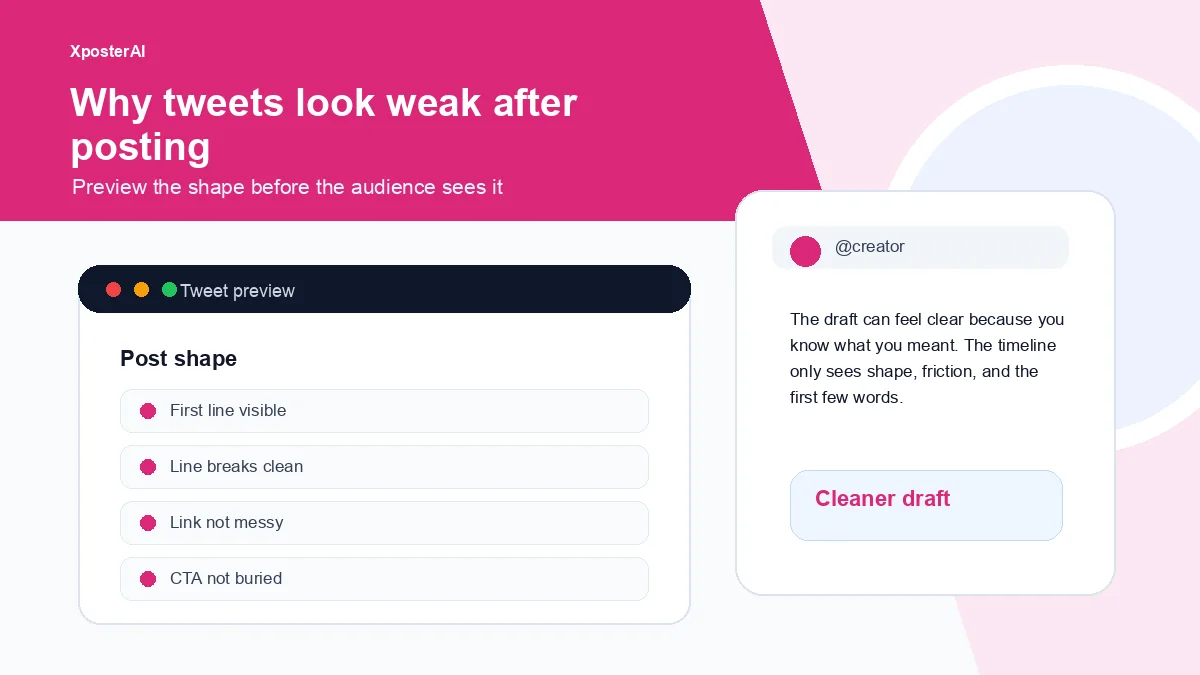
That is not always a writing problem. Most of the time it is a shape problem — the hook is buried, the spacing is awkward, the link looks messy, the CTA arrives before the value, or the post is trying to do two things at once. The fix is to preview the post the way the feed will render it before you publish. The Tweet Preview Generator, Tweet Link Cleaner, and Social Post Line Break Formatter cover most of that ground.
The timeline reads shape first
People do not read your post the way you wrote it. They scan:
- first line
- paragraph shape
- link or media
- obvious payoff
- whether it feels like work
If the first line is throat-clearing, the reader may never reach the useful part. If the link is a long tracking-heavy URL, the post can feel spammy even if the idea is good. If the CTA shows up before the value, it feels like an ask instead of a next step.
The five-second preview test
Before posting, look at the draft like a stranger.
Can you see the hook without reading the whole post?
Does the post have one clear job?
Are the paragraphs breathable on mobile?
Is the link clean enough not to steal attention?
Does the CTA come after the reason to click?
If you need to explain the post to yourself, the timeline will not do that work for you.
Before and after
Before:
Launching my new guide today! I spent a lot of time on this and would love support. Here's the link with tracking and details: https://example.com/guide?utm_source=x&utm_medium=social&utm_campaign=launch
After:
I turned the last 30 days of creator workflow notes into a free guide.
It covers hooks, replies, link cleanup, and profile audits.
Start here: https://example.com/guide
The second version is not just prettier. It gives the eye a path. The first version asks for support before it tells you what it is.
The common fixes
Move the payoff closer to the top.
Cut the first sentence if it only explains why you are posting. "Launching my new guide today!" is a status update for you, not a reason for them.
Split dense paragraphs into two lines only when the break helps the rhythm. Line breaks scattered like confetti read as performance.
Clean the link if measurement is not the point of the post. The cleaned example.com/guide reads as a destination. The UTM-stuffed version reads as a campaign someone is running on you.
Preview the post after you add the image, not before. Media changes what shows above the fold on mobile, and the line you thought was your hook can end up below it.
Preview before the timeline does
Use the Tweet Preview Generator to see the post shape, the Tweet Link Cleaner to remove ugly tracking clutter, and the line break formatter when adapting the same idea for LinkedIn, Threads, Bluesky, or Mastodon. If the link is part of a campaign, use the UTM Campaign URL Builder first, then decide what should be visible in the post.
FAQ
Do line breaks matter on X?
More than the writing advice from 2019 admits. The X timeline truncates posts after a few lines on mobile, and where you put the break decides whether the reader sees a hook or a fragment. Too few breaks make the post a wall. Too many turn the post into theater — every line a paragraph, every paragraph a performance. The right answer is usually two or three breaks in a long post, placed where the meaning actually changes.
Should I remove UTM parameters from every link?
No. Use UTMs when measurement matters. Just avoid letting a long parameter-heavy URL become the visual center of the post.
What should I preview before posting?
Preview the hook, mobile shape, link appearance, paragraph spacing, media placement, and CTA position.