Bold text on X is like hot sauce. A little can help. Too much ruins the plate.
Because X does not give you actual rich text, every "bold" post you see is faking it with Unicode characters from the Mathematical Alphanumeric Symbols block — the same block screen readers stumble over. So when you reach for bold, you are not formatting. You are swapping out the letters themselves. That is worth knowing before you bold a whole tweet.
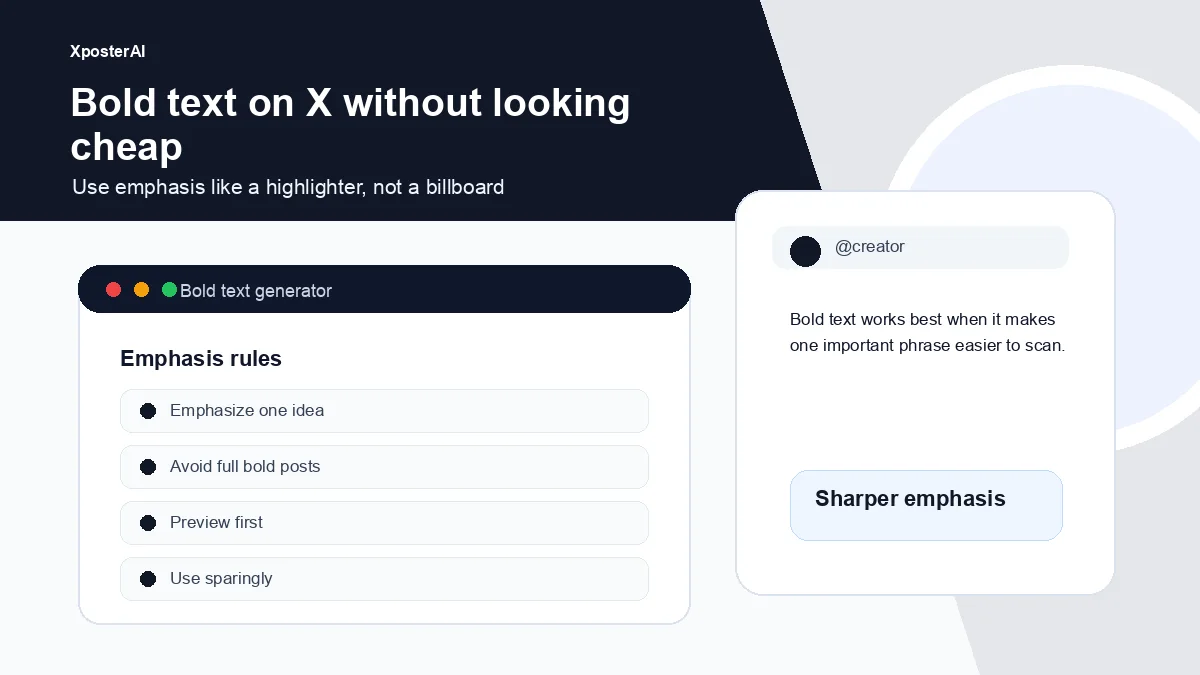
One short phrase, one label, one metric. That is the budget. The Twitter Bold Text Generator covers bold and italic Unicode variants, but the real work is deciding what deserves the emphasis at all.
Good uses of bold text
Bold text works best when it guides the eye.
- A section label: 𝗕𝗲𝗳𝗼𝗿𝗲 / 𝗔𝗳𝘁𝗲𝗿
- A key question: 𝗪𝗵𝗼 𝗶𝘀 𝘁𝗵𝗶𝘀 𝗳𝗼𝗿?
- A metric: 𝗧𝗵𝗲 𝟯 𝗰𝗵𝗲𝗰𝗸𝘀
- A warning: 𝗗𝗼 𝗻𝗼𝘁 𝘀𝗽𝗹𝗶𝘁 𝗮 𝘄𝗲𝗮𝗸 𝗶𝗱𝗲𝗮 𝗶𝗻𝘁𝗼 𝗮 𝘁𝗵𝗿𝗲𝗮𝗱.
It should make the post easier to scan, not louder.
Bad uses of bold text
Avoid full bold posts. They are harder to read and they read as someone yelling for attention they have not earned yet.
Avoid bolding the CTA just because you want clicks. The bold does not move the click — the reason to click does.
Avoid stacking bold text, an emoji garnish, a hashtag block, and a tracking-fat URL in one short post. That is four visual signals all asking for the same eye in the same second.
Before and after
Too much:
𝗜 𝗷𝘂𝘀𝘁 𝘀𝗵𝗶𝗽𝗽𝗲𝗱 𝗮 𝗻𝗲𝘄 𝘁𝗼𝗼𝗹 𝗮𝗻𝗱 𝘆𝗼𝘂 𝘀𝗵𝗼𝘂𝗹𝗱 𝘁𝗿𝘆 𝗶𝘁.
Better:
Most creator profiles do not need a redesign.
They need one clearer promise:
𝗪𝗵𝗼 𝗶𝘀 𝘁𝗵𝗶𝘀 𝗳𝗼𝗿?
That is enough emphasis.
Generate emphasis, then preview it
Use the Twitter Bold Text Generator for short emphasis, then check the final shape with the Tweet Preview Generator. If you are formatting across platforms, use the Social Post Line Break Formatter.
FAQ
Is bold text bad for accessibility?
Yes, more than people admit. Unicode bold is not bold at all — it is a separate set of characters that VoiceOver and many other screen readers will either skip, spell letter by letter, or read as "mathematical bold capital A, mathematical bold capital B." If a follower of yours uses a screen reader, a fully bolded post is closer to gibberish than emphasis. One bold phrase per post is a fair compromise. A whole bold tweet is not.
Can you use bold text on X?
You can paste Unicode characters that look bold. X is not styling anything — you are just sending different glyphs.
What should I bold?
One important phrase, label, metric, or contrast point. If you are already on your second bold span in the same post, you are probably hiding a weak first line.