X has no bold button, no italics, no formatting toolbar. Yet your feed is full of 𝗯𝗼𝗹𝗱 𝗵𝗼𝗼𝗸𝘀 and 𝓯𝓪𝓷𝓬𝔂 𝓫𝓲𝓸𝓼. Here's the trick behind it, the full menu of styles, and the two costs almost nobody tells you about.
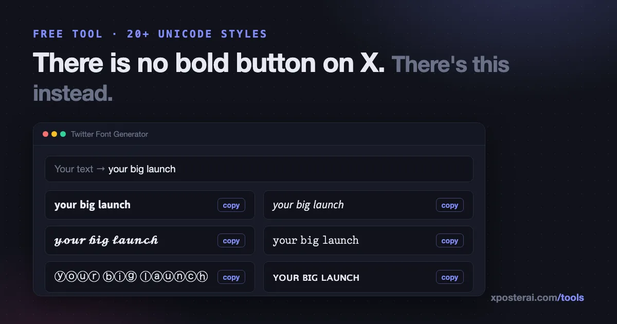
The short version: those aren't fonts. They're different Unicode characters that happen to look like styled versions of A–Z. Because they're characters, not formatting, they survive copy-paste into X, LinkedIn, Instagram bios — anywhere text goes. Our free Twitter Font Generator converts plain text into 20+ of these styles with one-click copy.
How the trick works
Unicode — the standard that maps every character to a number — includes a block called Mathematical Alphanumeric Symbols, added so mathematicians could distinguish a bold A from an italic A in equations. The internet promptly repurposed it for aesthetics.
So 𝗯𝗼𝗹𝗱 isn't the word "bold" with styling — it's four entirely different characters (𝗯 is U+1D5EF, a "mathematical sans-serif bold small b"). X just renders what you paste. That's why no app update can take it away, and also why several things quietly break — see below.
The styles
The generator does 20+ styles live as you type. The families:
| Family | Sample | Typical use |
|---|---|---|
| Sans bold / italic / bold-italic | 𝗯𝗼𝗹𝗱, 𝘪𝘵𝘢𝘭𝘪𝘤 | Emphasis in posts, headline lines |
| Serif bold / italic | 𝐛𝐨𝐥𝐝, 𝑖𝑡𝑎𝑙𝑖𝑐 | A more editorial look |
| Script / bold script | 𝓈𝒸𝓇𝒾𝓅𝓉, 𝓼𝓬𝓻𝓲𝓹𝓽 | Bios, names |
| Fraktur / bold fraktur | 𝔣𝔯𝔞𝔨𝔱𝔲𝔯 | Novelty |
| Monospace | 𝚖𝚘𝚗𝚘 | A code-ish aesthetic |
| Double-struck | 𝕠𝕦𝕥𝕝𝕚𝕟𝕖 | Numbers, logos |
| Bubble / filled bubble | ⓑⓤⓑⓑⓛⓔ | Playful lists |
| Small caps | sᴍᴀʟʟ ᴄᴀᴘs | Understated headers |
| Fullwidth | vapor | The aesthetic aesthetic |
| Strikethrough / underline | s̶t̶r̶i̶k̶e̶ | ~~changed my mind~~ jokes |
The two costs
1. Screen readers. This is the big one. Many screen readers read 𝗯𝗼𝗹𝗱 as "mathematical sans-serif bold small b, mathematical sans-serif bold small o…" — or skip the word entirely. A whole post in fancy Unicode can be unreadable to a blind follower. The kind version: style a word or two, never whole sentences, and never information someone must not miss.
2. Search and indexing. 𝗦𝗰𝗵𝗲𝗱𝘂𝗹𝗲𝗿 doesn't match a search for "scheduler" — they're different characters. Anything you want to be findable (your name, your product, keywords in your bio) should stay in plain text.
There's also a subtler style cost: overuse reads as engagement-bait. We wrote a whole post on using bold on X without looking cheap — the summary is one bolded phrase per post, where the emphasis genuinely lands.
Character counting
Most of these styled characters live outside Unicode's Basic Multilingual Plane, and X counts them as two characters each. A fully-styled 280-character draft is really a 140-character draft. Our character counter counts them exactly the way X does, so you find out before the compose box eats your ending — worth a check alongside the character limits guide.
Sensible defaults
- Style the hook, not the post.
- Bio: name in plain text, one styled flourish max.
- Never style hashtags, handles or links — they break.
- Test with a screen reader once. It's sobering.
Try the Twitter Font Generator — type once, copy any of 20+ styles, free and entirely in your browser like the rest of our tools.