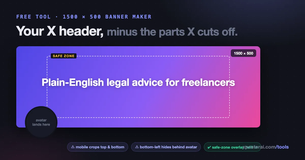
The direct answer: your X header should be 1500×500 pixels (3:1 ratio), and everything important should live in the middle ~60% of it. The edges get cropped on mobile, and the bottom-left corner sits behind your avatar. Most bad banners aren't badly designed — they're designed for a rectangle that doesn't survive rendering.
We built a free X Header Maker that bakes these rules in: gradients, patterns, your text, and a safe-zone overlay that shows exactly what your avatar and the mobile crop will swallow. Design in the browser, download the PNG. This post is the sizing knowledge behind it.
The numbers
| Thing | Size |
|---|---|
| Upload dimensions | 1500 × 500 px (3:1) |
| Avatar overlap | Bottom-left, roughly a 400×400 circle's worth on desktop rendering |
| Mobile crop | Top and bottom edges lose ~60px each on many devices |
| File | PNG or JPG, under 5 MB (PNG for text/flat color) |
| Retina tip | Design at 3000×1000 and let X downscale — text stays crisp |
The practical safe zone: keep text and logos inside the center band, and treat the bottom-left quarter as gone. On your own profile it might look fine — check it on a phone, someone else's phone, and both themes before calling it done.
What a header is actually for
Your profile is a landing page. Visitors decide in seconds using exactly three elements: avatar, bio, header. The header is the biggest of the three and most people treat it as decoration.
The headers that convert visits into follows say one thing:
- The one-liner — your positioning statement in large text ("Plain-English legal advice for freelancers"). Reinforces the bio; survives even when someone doesn't read the bio.
- The proof — press logo, podcast name, "as seen in", one concrete achievement.
- The product shot — for builders: one clean screenshot of the thing you make.
- The vibe — photographers and artists: your actual work, cropped to 3:1.
One message, big type, real contrast. If you're auditing the rest of the profile while you're at it, run through the X profile audit checklist — and if visits aren't turning into follows, this post diagnoses why, with bio examples that pull their weight.
Five header mistakes the safe-zone overlay catches
- Text in the avatar corner. The classic. Looks perfect in your design tool, decapitated on the live profile.
- Edge-to-edge composition. Mobile crops the top and bottom; your carefully placed tagline loses its ascenders.
- Tiny text. The header renders about 340px wide on a phone. If it isn't readable at that width, it isn't readable.
- Low contrast against both themes. The header sits directly against X's UI — a white-edged banner bleeds into light mode, a near-black one into dim mode.
- Five messages at once. Logo + tagline + URL + QR code + photo = nothing lands. (If you genuinely need a scannable link somewhere, that's what the profile QR code tool is for — on slides and print, not squeezed into your banner.)
Make one in five minutes
- Open the X Header Maker.
- Pick a gradient or pattern that matches your avatar's palette.
- Add your one-liner, sized large, inside the safe zone the overlay shows you.
- Download the PNG, upload to your profile, then check it on mobile in light and dark mode.
Everything runs in your browser — nothing uploads, nothing is stored, no watermark. It lives with the rest of the free tools, and once the profile looks right, your pinned post is the next thing visitors read: here's what to pin.